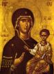
I was looking at the catalog of my favorite icon supplier today (St. Isaac's Skete, skete.com), and was struck by a contrast between two icons.
I liked one much more than the other. [apologies these are so small, but my view in the catalog was similarly small, and small size lets one see the overall painting better.
The one I liked least - no offense to the good nun who painted it - was a modern take on a classic:
http://www.skete.com/index.cfm?fuseaction=product.display&product_id=692The one I liked better the classic, one of the true classics of Palaeologian iconography:
http://www.skete.com/index.cfm?fuseaction=product.display&product_id=693Does anyone else also feel this way?
So I asked myself, why it is, and came up with the following possible ideas:
- color: the range of colors on the older icon, as preserved today, is narrower than the modern one. The colors are often different too - in modern icons I frequently see almost a cartoon-strength color. The colors in the older icon are less drab and in my view have a certain majesty in them. The "cartoon colors" are not bad things per se, but I think the range may be too wide and the colors not often well chosen. I also think the color work in the Palaeologian masterpieces (e.g. this one, or the ones from the era on Mount Athos or at the Chora Monastery) is also masterful in their choice of color and their careful gradations of color.
I'd also say similar about forms, for instance the faces (often rather flat in many modern icons) and the robes. I was looking at a copy of the Pantocrator at the Protaton on Mount Athos yesterday, the main icon in my icon corner, and was struck again by the subtleties in the forms and colors in Christ's face and in His Robes.
- composition: the older iconographer wisely put a saint with a white robe next to Ephrem in the bottom middle. Art theory, borne out frighteningly well in my observed practice, states that the eye goes to the brightest/largest point in a frame and then works its way up and clockwise from around 10 o'clock. This theory leads us through the mourning monks, to the Odigitria icon above Saint Ephrem, to the right choir, and then to Saint Ephrem himself.
In contrast, the newer one copies this, but the monk in white is at the very edge of the frame and placement of the robes does not lead the eye in the same way. I also think the portrait orientation is inappropriate for this subject.
Also, I would have thought that my basic art instinct, derived from my amateur photography, would have led me to prefer the less busy one, since modern art theory not only generally emphasizes simplicity, and since photography always does (since clutter is easy to overlook during the photographic process and since complex compositions with lots of sub-subjects like in the older St. Ephrem icon is VERY hard to do in photography).
But either way, I liked all the extra details one could go to after the main subject. I also like their distance from each other, allowing one to look at them separately.
Just my perspective. I'd love to hear others' reactions.